>
Lab 6 - GEO 580, Spring '02
LAB 6: Surface Analysis
Suggested time for completion: One week
6.1. Purpose
- To introduce students to the use of surfaces in GIS, including issues such
as:
- data structures for elevation and other continuous surface data,
- creation of DEMs and TINs,
- accuracy and resolution,
- effective display of elevation and other '2 1/2D' information,
- and uses of DTMs.
- You will also become familiar with the use of data frames in ArcInfo8.
6.2. Introduction and background
The term Digital Terrain Model (DTM)
is a generalized term for any digital representation of a topographic
surface. Three such representations are DEMs, TINs, and contour coverages:
- The term Digital Elevation Model (DEM) refers (almost
always) to rasters or grids with regularly spaced height values.
- Triangular Irregular Networks (TINs) are irregularly spaced
points with elevation values that are the vertices of triangles that represent
the surface.
- In ArcInfo8, a contour map can be stored as a coverage, with each line in
the contour being attached to a height attribute.
Note that while actual real-world topography
is the most common surface that GIScientists wish to represent, there is in fact
a great variety of continuos spatial information that is well represented as a
surface. A short sampling could include predicted rainfall, temperature,
earthquake probability, mineral or pollutant concentration, and human population
(or another animal, for example; Ducks Unlimited has done a study where they
kriged duck counts to make a map of duck density in the prairie-pothole region
-- mountains of ducks, as it were).
This lab will focus on topography, but keep in mind
that many of the issues and techniques discussed will be applicable to these
other kinds of continuous geographic information.
Basic information on USGS
DEMs
The US Geologic
Survey is in the process of creating a national database of DEMs. The
source data for this project includes contour maps and stereo pairs of air
photos. Several methods have been used to create DEMs, which you can read
about on the USGS
page on DEMs. These methods can be manual (e.g., having a human
estimate elevation along a regular grid) or more-or-less automated
(interpolating a digitized contour map into a DEM). Many of these
techniques leave artifacts (artificially introduced patterns in the data)
in the dataset, however.
The USGS produces DEMs at a variety of scales.
Much of this is currently free to download in SDTS (Spatial Data Transfer
Standard) format. The EROS Data Center
hosts the USGS DEMs and DLGs at
the USGS
Geographic Data Download site.
The Future of DEMs: SRTM
In February 2000, the Shuttle Endeavor flew the Shuttle Radar Topography Mission
(SRTM), and in ten days it mapped 80% of the Earth's land surface -- 94.59% of
that twice. SRTM should provide almost complete DEM coverage of areas
between 60 N and 60 S, at a high resolution of about 30 m. This is
equivalent to the large scale 7.5-minute DEMs (also about 30 m resolution), but
with uniform coverage both inside and outside of the US and without the
artifacts characteristic of DEMs generated in other ways. The 30 m
resolution is also equivalent to Landsat TM resolution and thus provides rich
opportunities for combining data. The data is currently being processed
and distribution will begin in November 2001.
Currently, samples of
the SRTM dataset have been released:
A bug specific to this lab:
- The spatial reference of the data from occasionally seems to cause
problems. A dataset may have a spatial reference when viewed in
ArcCatalog, but then apparently not have it when viewed in a data frame
in ArcMap.
- Workaround: Create new layer with the same (?) projection info in
ArcCatalog, and use that.
- Also, use a frame with no spatial ref. when your data has none --
e.g., TINs
|
6.3. Data
| For more information on USGS DEMs:
|
Download the data for lab 6 to your
c:\temp drive. It contains these layers:
- sbdem -- A DEM of Santa Barbara County.
- sbroads -- A street layer for Santa Barbara County.
- sblandcov -- Landcover map of Santa Barbara County, used in Lab 4.
- landcov.cnddbnames -- Names for
sblandcov polygons.
- blockgroups -- Santa Barbara County census blockgroups.
- sbcounty -- An outline of Santa Barbara County
Copy the data to
your local work folder.
6.4. Procedures
Your map for Lab 6:
For this lab, you will be using ArcMap
data frames to make your maps. Every time you have dropped
data into ArcMap, you have put it into the default data frame. What
we will do in Lab 6 is create three more data frames. Each of your
four data frames will hold a separate map, and you will print out and hand
in all four maps printed out on one page. This will be a challenge
-- focus on communicating one idea with each frame. You will also
have to think carefully about layout, what information is really
necessarily for these maps (you may decide to leave out a few things
recommmended in the basic
guidelines).
An introduction to
data frames is provided below. |
| Introduction to Data Frames
Go to ArcMap. You will notice that your
default view is the analysis view of Data Frame 1, named Layers.
- Rename the frame Layers to Data Frame 1 (or
another name you prefer).
- Add three more data frames.
- Go to the Layout view (
 ) in ArcMap. ) in ArcMap.
- This would be a good time to change the page layout from
portrait to landscape (File --> Page Setup).
- Go to the menu bar and hit Insert --> Data Frame.
- Position this data frame and the original one in the upper-right
and upper left quadrants of your page. Put the next two frames
in the lower quadrants.
- Note: you could also copy (CTRL-C) your
first data frame and paste it (CTRL-V) three
times.
- Give the frames appropriate names like Data Frame 1, 2,
etc. (you can change them as you move through the lab).
- Some notes on frames:
- Active/Inactive Data Frames: Only one data frame can be
active at a time. A frame must be active for you to drag data
into it, view the data, or edit the data.
- After you return to Data view: to switch the frame you
are looking at, right-click on the data frame heading
and select Make active data frame (Note: command may be
called Activate in 8.1).
- You can drop layers from ArcCatalog into any of the data frames,
or move or copy layers between frames.
- Once you've arranged the data for each frame the way you like, you
can return to Layout view and resize the frames if necessary,
as well as add titles, etc.
|
6.4.1. Methods of DEM
display
- To begin, transfer sbdem into ArcMap.
You probably don't have any great love for the
continuous grayscale that ArcMap puts on your DEM display as a
default. However, displaying DEM information clearly and attractively
is tricky. There are a number of options in ArcMap to improve the
display of the DEM:
| DEM Display Improvement #1: Color Ramps.
In the Layer Properties window (get there
by right-clicking sbdem, then Properties--> Symbology
tab), click on Stretched.
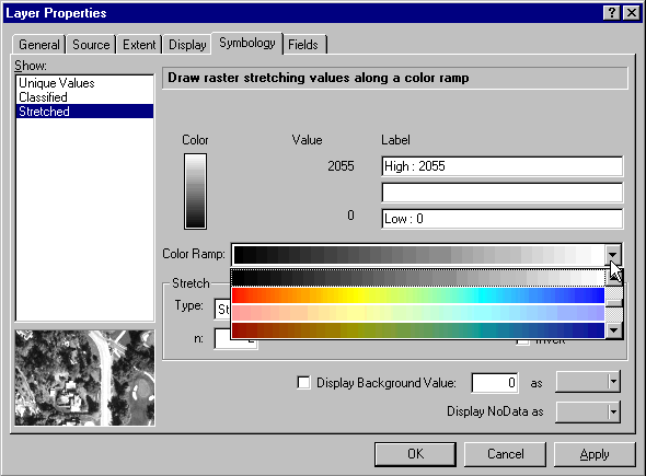
- Change the default greyscale color ramp to another one that
looks more exciting.
- Drag your Layer Properties window aside a bit so that
you can see a good portion of the map.
- Click the Apply button instead of OK (so that
your properties window stays open) and look at the resulting map.
Try a few different color maps. Having trouble
finding one you like? |
| DEM Display Improvement #2: Style Manager.
ArcInfo8's Style Manager gives you access to a
number of very useful pre-defined symbols and color ramps. You
can also save styles that you create.
- Close your Layer Properties window.
- In ArcMap, go to Menu Bar --> Tools (not
ArcToolbox!) --> Styles --> Style Manager.
- You should get a window like this. It works much like
Windows Explorer or ArcCatalog:
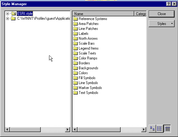
- ESRI.style contains
the predefined styles, while the second folder contains styles
designed or copied by the current user, Guest (In this case that
is you and whoever else has been using the computer). You
can see that the styles are grouped for various uses -- Reference
Systems, Area Patches, etc.
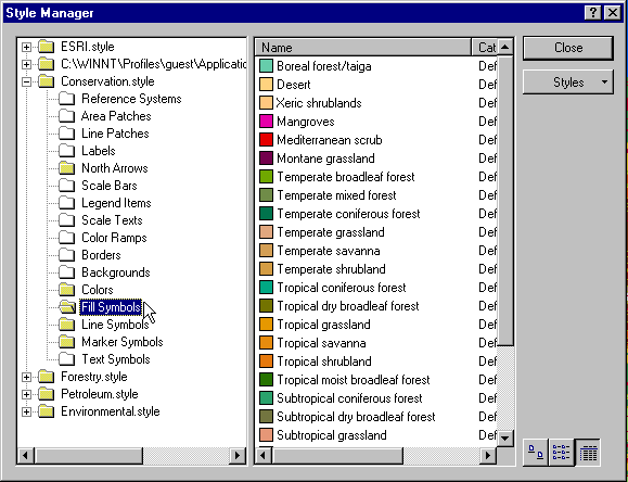
- Click on the
 button. You can see a large
number of topics which ESRI has created predefined styles
for. You can click on them to add them for a particular
project. E.g., a person mapping vegetation might use
something like this: button. You can see a large
number of topics which ESRI has created predefined styles
for. You can click on them to add them for a particular
project. E.g., a person mapping vegetation might use
something like this:
- The most useful color ramp styles are in ESRI.style. Go to Color
Ramps and then scroll down until you see Elevation #1:
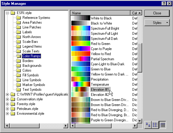
- Highlight it. Right-click and Copy.
Navigate to the Guest directory and then to the color ramp
folder. Right-click, Paste in the right pane of the
window. Close the Style Manager.
- Now, when you return to Properties-->Symbology for
sbdem, you should have the Elevation #1 color ramp
available somewhere in your list of color ramps. It won't be
labeled; but it should look like this:

For More Info on Styles:
ESRI's White
Paper on Map Making with Styles. |
Use this color scheme or Elevation #2, if you
like. These color schemes probably succeed because they
use a variety of colors, instead of just shades of one or two
colors; and because the colors are arranged in a way that
parallels map conventions we are used to (white for mountain
tops, etc.) |
|
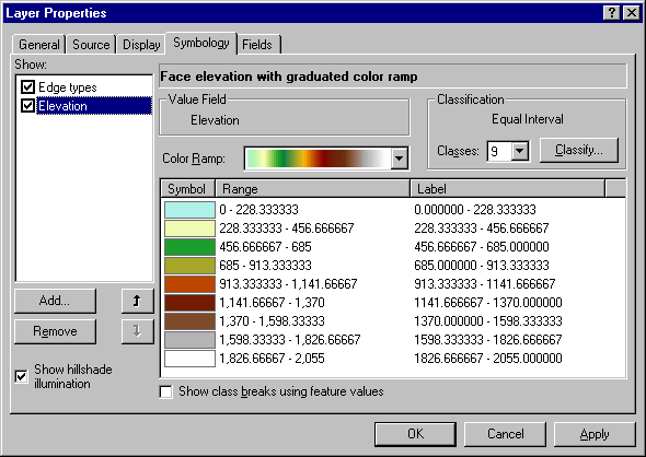
| DEM Display Improvement #3: Classes
Another way to improve clarity is to group
the elevation values into classes and have the color change abruptly
when a threshold is crossed; this allows the viewer to identify a
region as being in a specific elevation class, rather than having to
think about where that region's particular shade fits into a smooth
continuum on the legend bar.
- Return to the Symbology tab for sbdem.
- Click on Classified. (Under "Show" on the left
side of the window)
- Click on the
 button and change the
classification method to Equal interval. Then click
okay. button and change the
classification method to Equal interval. Then click
okay.
- The Elevation color ramps that you copied from ESRI.style
should still be available. Select one of them.
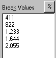
- You can see that your elevation has been split into 5 classes
at equal intervals of 411 meters.
- Change the number of classes, like so:
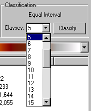
- Do this a few times and hit
 . .
- With equal interval classification, you will see that ArcMap
divides the range of values evenly, which usually results in
arbitrary-looking numbers and long fractions. Far more
logical would be to have the breaks fall on nice, even
numbers. In this case 400 m (resulting in 10 classes, plus a
final class for the top 55 m of the county) seems
reasonable.
- Click . You will see a
window like this. The graph shown is a histogram of the
number of pixels (y-axis) vs. elevation of pixel (x-axis):
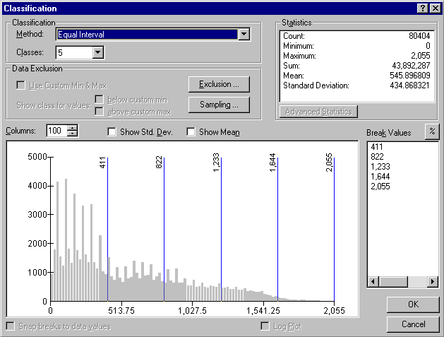
- There are two ways to do edit the breaks to do this:
- Method #1:
- You can change the breaks by dragging the vertical blue
lines. You will notice that when you do this, the
classification "Method" changes to "Manual". If your
breaks are coming out with 6-digit decimals, check the box
next to "Snap breaks to data values,"
i.e.,
 . This will round
your breaks to the nearest data values. . This will round
your breaks to the nearest data values.
- You can also Insert and Delete Breaks by
right-clicking in the histogram. You can examine
portions of the histogram more closely by right-clicking and
selecting Zoom In, or by clicking and dragging to
create a zoom-in box.
- To type in specific values as breaks, click once on the
break value in question, then click again to edit
it:
- Method #2:
- What we would really like is an easy way to set the breaks
to occur every 400 m, starting at sea-level. Click on
the arrow to the right of classification "Method" to see your
options:
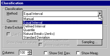
- Select "Defined Interval," and make the interval
size 400. Hit the keyboard TAB or click in the Break
Values box to see the resulting breaks on the histogram
(keyboard ENTER doesn't work). Click OK, then
click Apply or OK.
|
Your map -- Data frame #1:
Use a classified map of mainland
Santa Barbara county elevations for your first data frame. Make
sure the color scheme is something that will print reasonably well in
black & white. |
| Answer Question 1 : While you were classifying the DEM, you may
have noticed an unexpected pattern in the histogram of the data. Go
back and look at the histogram again. The distribution of elevations
is not what you would expect if the elevation had been directly measured
for every pixel (as would be the case in, for example, SR-TM data).
Describe the pattern and explain why it is
there. |
There are many other options for
displaying DEMs, although using them in ArcInfo8 will depend upon the
availability of various extensions such as 3-D Analyst (More
information on ArcInfo extensions). Some common ones you will
see:
- Topographic Shading: Here, the DEM is used to simulate the
effects of sunlight reflecting off of topography with differing slope and
aspect. This effect is always seen in visible-infrared satellite
imagery. To run the simulation program, the user must usually choose a
sun geometry -- i.e., how high is the sun in the sky and what direction is
the sunlight coming from. The simulation gives the viewer a sense of
the relief, although not any quantitative elevation information. Here is an example of
topographic shading from the USGS.
- Additional Note: Calculations similar to those used for topographic
shading are also useful in other areas. For example, one may wish to
calculate the insolation that a slope receives over the course of a year,
to study what influence this has on the vegetation that grows there.
Or one may wish to remove the influence of topographic shading from
a remotely-sensed image.
- We will see ArcInfo8 display topographic shading when we view the TINs
we create. When TINs are created, each triangle has an attribute for
slope and for aspect, as well as elevation.
- 3D Perspective: ESRI's 3-D Analyst and other software
packages can display DEMs in 3-D -- e.g., "what would Mt. Shasta look like
from the side?" Animated "fly-throughs" can also be built from DEMs,
if you have enough computing horsepower. Perspective views and
animations tend to be most useful for "gee-whiz" displays for general
audiences rather than for analysis itself.
6.4.2. Data Structures For Digital Elevation Data
Review the Introduction
to this lab and the Lab 2 to make sure you have a clear idea of what data
structures are and what the main kinds of DTMs are. Often, DEMs will retain
artifacts that would not be seen if the DEM had been generated
from actual elevation measurements [estimates] for each pixel of the DEM.
Also, converting elevation data between different data structures, while useful for
many purposes, will always result in loss of data and often have severe effects
on accuracy or other important features.
Contours. First, we are going to create a contour
coverage from our DEM sbdem. We will space our contours every 200
vertical meters.
| Possible bug: If you have difficulty creating the contour
layer due to "not having a licence for TIFFZW" or due to not having the
"TIN Wizard" installed, a contour coverage (sbcontour) has been
provided in the dataset. Use this for the
lab. |
First, find the Contour Wizard in ArcToolbox. If you have
trouble finding it, go to ArcToolbox's Menu Bar --> Tools -->
Find.
- Use sbdem as your input surface.
- Make the contour interval 200 m.
- Keep the base contour at 0.
- Keep the output item as CONTOUR. Note that this will be an
item in the contour coverage's AAT.
- Change the default weed tolerance to 50, but click on the help
button for this step and read about weed tolerance. There will
be a question on this later.
- Keep the output z-value in meters.
- Name the output coverage sbcontour. Make sure it ends
up in your lab6 directory.
Double-check that you did
everything right by reading through the last step, the Summary of your
input. Click Finish. |
- Define the projection of your new sbcontour coverage based on
sbdem using the Define Project Wizard mentioned in lab 3
- Put sbcontour into ArcMap, on top of sbdem.
Your map -- Data frame #2:
Use a contour map of mainland Santa
Barbara county elevations for your second data
frame. |
TIN Creation. Now, we're going to create
two TINs from our elevation data.
| Possible bug: When converting from Grid to TIN, first try the
tool in the IMPORT TO TIN folder, rather than then EXPORT FROM RASTER
folder. In theory it is the same tool, but when running from one
rather than the other you will occasionally receive an error that you are
not licenced to use TIFFLZW. If you receive this error, try the tool
in the other folder. If you still can not make the tool work,
consult with your TA. |
First, from our DEM: Find the ArcToolbox tool Grid to
Tin.
- Use sbdem as the input grid.
- Keep the defaults.
Name your output
sbdemtin. |
| Possible bug: When using the Create TIN Wizard, you may
encounter an error that you are not licenced to use TIFFLZW. If this
occurs, use the sbtin dataset provided in the lab
data. |
Second, from our contour coverage sbcontour. Find
the ArcToolbox Create Tin Wizard:
- Step #1: Click the
 button. button.
- Step #2: Use sbcontour as your input coverage.
Leave the other options as defaults and click Next.
- Step #3: Leave the Specify a Z-value constant window
blank, but click the toggle for the second item,
- like so:
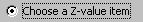
- Select CONTOUR as your Z-value item. Click Next.
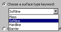
- Step #4: Click the first toggle and select
'Softline':
- Step #5: Click Next. We don't need to select
specific features.
- Step #6: We are now back to choosing a dataset for the
TIN. You have just added sbcontour, so now select it and
click Next.
- Step #7: Name the output TIN sbctin. Click
Next.
Click
Finish. |
| Answer Question 2 : DEMs and TINs are often referred to as "2
1/2-D" rather than "3-D." Why do you think this is? Hint: In a
surface, how many z-values are there going to be for a given (x, y)
coordinate? In a system that requires a truly 3-D structure, how many
z-values are possible per (x, y)?
For additional help, you may wish to try (linked 9/19/00): http://www.users.bigpond.com/dsandison/Chap3_final.htm |
- Put the two TINs into ArcMap, Frame #3. Classify the elevation
symbology of both TINs with the default color ramp (TINs have Elevation #1 as
their default color ramp), using defined intervals of 400 m as we did
with sbdem. Visually compare the two TINs.
Your map -- Data frame #3:
After answering the questions dealing with
the comparison of the two TINs, leave the best TIN in frame 3. We
will use it as part of our viewshed analysis map (see
below). |
| Answer Question 3 : Upon visual inspection, what are the
differences between sbdemtin and sbctin? Consider:
level of detail and information lost in the creation of each TIN.
Also use the identify tool and click around on the Santa Barbara Channel
for both TINs. Explain the elevation results for the ocean in both
TINs and the reason for the differences between
them. |
| Answer Question 4 : Examine the histograms for your two TINs.
What are the unnatural patterns in each and what are the likely causes of
them? |
Topographic Shading in TINs.
You can see that your TINs display topographic shading by default:
Hint
You won't be able to see  in the Symbology window
unless Elevation is highlighted, like this: in the Symbology window
unless Elevation is highlighted, like this: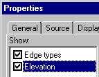 |
To turn off shading, go to Symbology (again) and
uncheck this box:
. Hit to see what happens.
If you wished to show shading on,
say, our color-ramped DEM sbdem (or other layers, for that
matter), you could drape a semi-transparent, shaded TIN on top of
it.
- To make a TIN semi-transparent, go to
Properties-->Display and make the %Transparency
something like 30%.
You would also want to make the base color
of the TIN uniform -- instead of separate classes by elevation,
you should have one class colored white.
|
| Answer Question 5: What kinds of geographic information would be
most useful to you if you were seeking to mitigate the major problems you
have discovered with the TINs above? Especially consider: what would
be the best source data to use for generating
TINs? |
| Definitions (from the ESRI GIS Glossary):
|
Displaying Slope and Aspect
When we created our TINs, slope and aspect
attributes were created for each triangle along with elevation. These can
be displayed as their own layers or used for analysis. Common topics where
slope and aspect are important features to consider include erosion and
landslide hazard assessment, vegetation modeling in ecology (the north face of
slopes is often cooler and wetter and may grow different species), and forestry
(aspect and slope will influence the quality of a site for tree growth, and may
favor certain species or varieties). As mentioned previously, slope and
aspect are also used in the calculation of topographic shading.
We are going to practice displaying and analyzing
slope.
To Display Slope:
- Create a new layer from sbdemtin in ArcCatalog. Name
it slope_sbdemtin.
- Still in ArcCatalog, go to
Properties-->Symbology for this slope_sbdemtin.
- Highlight Elevation, like so:
- Uncheck Edge types, Elevation, and Show hillshade
illumination so that they won't display.
- Click the
 button. The Add Renderer comes
up: button. The Add Renderer comes
up:
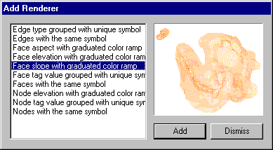
- Highlight the line "Face slope...", then , then
 . .
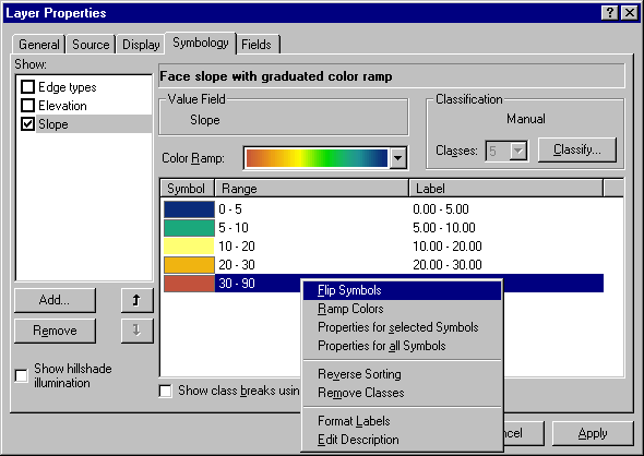
- Pick a logical color ramp that communicates degree of slope (e.g.,
red for high slope, blue for flat). You may want to return to
the Style Manager to find or create a good one.
Precipitation, with the color order flipped, seems to work well.
- Note: a nifty trick is that you can Flip Symbols
by right-clicking in the Symbology editing window (see
graphic below).
- Decide on how many classes you want to group slope into, and
classify the ranges manually if necessary (look under the button.
- Make sure the button is unchecked (it
appears to re-check itself if you switch between Elevation and Slope
displays in the Symbology tab). Your final Symbology might look
something like this:
- Click OK. You have now created a layer file that will
retain your Symbology setup when you transfer it to ArcMap.
- Drag it into ArcMap.
|
Answer Question 6 : At 8 p.m. on July 31st, 2000, a landslide
occurred about 26 miles west of Santa Barbara (near the Tajiguas
landfill). "Hundreds of tons" of earth slid towards the beach,
leaving "a 300 foot section of track hanging in midair."
Fortunately, sensors stopped two approaching freight trains, but an Amtrak
train had passed over the tracks "just hours earlier." (Van de Kamp,
Santa Barbara News-Press, 2000) It was a perfectly calm day in the
middle of a dry summer.
Imagine
that you have been hired by Union Pacific Railroad (http://www.uprr.com/ ) to try and use GIS
to try and identify other areas where landslides are a possibility.
Obviously in real life, one would need specialist training or advice to
adequately do such a job; but you should be able to lay out a general
strategy for such an analysis (what data layers you would need and what
kinds of analysis you would do). Do so in one
paragraph. |
Your map -- Data frame #4:
Use your slope map for frame 4. Make
sure that the color scheme will show when printed in black & white
printing. Also make sure that your map communicates a reasonable
balance of slopes -- e.i., don't have a 'high slope' class that is so
restrictive that only an insignificant part of the map shows up on
it. |
6.4.3. Analysis with DEMs
First, we will conduct a viewshed
analysis. Viewshed analysis is useful for several purposes, such
as determining the views available from roads, lookouts, and housing
developments. For example, logging or building may be restricted in
National Scenic Areas or areas viewable from highways.
First, we have to create a point feature coverage from which to do the
viewing.
- Create a point coverage for the point from which you want to do
the viewshed analysis. Pick a location you are familiar with
(your home, campus point, the top of the Highway 154 pass, etc.).
- Remember that new features must be created in ArcCatalog,
then transferred to ArcMap. They are then edited to
create the geometry.
- Knowing this, create the (empty) point coverage in your
lab6 directory (Don't remember how? Hint: When in
doubt, right-click)
- Name it viewpoint.
- Use sbcontour to define tics, boundaries, etc.
- If the sbcontour's projection has not been defined, use
sbdem to define the projection
- This will be a point feature (although one can perform viewshed
analysis on a line feature such as a road or river, for example).
- Put viewpoint in ArcMap.
- (Note: If you get the warning like "One or more
layers lacks spatial reference information" -- this means either
that you didn't define a projection or datum for one of your layers,
or a bug occurred and this information didn't get transferred with
the layer. If the latter is the case, you will probably have
to use the Project[ion] Wizard tool to create a new
coverage, and then use that in ArcMap.)
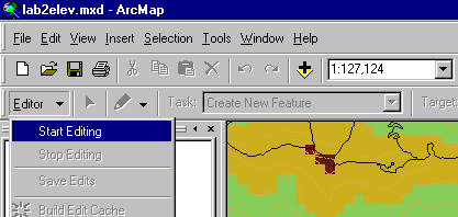
- Make sure the Editor toolbar is displayed and start editing
viewpoint.
- Place a viewpoint in a familar location.
- Save your edits and stop editing.
 |
- Now, find the Visibility tool in ArcToolbox.
Analysis methods for Visibility Tool
Frequency
method:
For each output grid cell, records the
number of times each grid cell can be seen from the set of viewing
points (or line features) in the input coverage.
Observers
method:
For up to 16 points in a point coverage,
for each grid cell records the observation points which can and can't
see that cell. |
- Use sbdem as the input grid, and viewpoint as the input
coverage. Name the output something logical (e.g.,
viewshed_iv). You can use either the Frequency or
Observer analysis method since we're only doing one
point. We will make the output dataset type poly because
our output will be simply two classes, visible and not visible. For
more complex analysis, type grid would probably be more appropriate.
- Once you have created the viewshed coverage, drag it into ArcMap.
Display it on top of the DEM. Use Properties --> Symbology
to make the attribute VISIBLE-CODE display (you should be able to figure
this out without help at this point). '1' in the viewshed coverage's
VISIBLE-CODE column means "This polygon is visible from point
viewpoint." Zero (0) means that the polygon is not visible, but
we don't need to display this information, so remove that row from
the Symbology display (Forgot how? Remember: when in doubt,
Right-click).
- As one of your four frames, make a map clearly showing elevation, your
viewpoint, and the viewshed.
| Question #7 : What is your assessment of
the viewshed? Does it fit with what you can actually see from that
point? What would account for
differences? |
Your map -- Data frame #3:
In frame 3, use the TIN you have left here to
represent elevation. Then display your viewshed and viewpoint on top
of this. |
More on ArcInfo 8.x Extensions:
Much of the GIS functionality needed for
scientific research comes from extensions to ArcInfo.
These are software add-ons that make new tools accessible. When
installed (they must be purchased from ESRI, of course) they will be
accessible as new tools in ArcToolbox and/or as new toolbars in ArcMap
(the latter are those drag-and-drop toolbars, such as the Layout, Draw,
Effects, and Network Analysis toolbars, which you have accessed from
ArcMap's Menu Bar --> View --> Toolbars).
You are probably familiar with ArcView
extensions such as Spatial Analyst. As ArcView is folded into
ArcInfo 8.1, ESRI intends to make the functionality of these extensions
available in ArcInfo extensions.
ArcNews
article including extensions in 8.1
More on
ArcView extensions from ESRI's webpage
More on
ArcInfo extensions from ESRI's webpage
Extensions in
ArcView/ArcGIS/ArcInfo 8.1 |
Our second analysis will examine the
relationship between elevation and vegetation. Drag sblandcov (we
worked with it in Lab 4) into ArcMap. Because the version of the software
as of this writing lacks functional extensions such as Spatial Analyst, we won't
do direct queries of grids (this could be done with ArcInfo Workstation,
however). We will use the skills we have learned for displaying and
converting data and then investigate the questions by visual inspection.
You will have to decide how best to display the vegetation and sbdem to
answer the questions below. You will also have to join the table
landcov.cnddbnames to the sblandcov coverage. You will use the
CNDDB1 field for the join field.
| Question #8 : Describe the vegetation profile as you move along a
straight line from Campus Point to the east edge of Lake Cachuma.
Make a list of the vegetation types in the order that the line crosses
them, and give approximate elevation ranges for each of the vegetation
types. You may use the following coordinates (on the dem cs):
from 105000/3620500 to 102000/3637000
Note: There are several decent ways to do
this. |
6.5. Conclusion
In this lab, you learned about the basic data structures
used
for surfaces in ArcInfo 8. You can see that each has advantages and
disadvantages in terms of conveying information, in conducting various analyses,
and in accurately representing the real world. You should also have an
appreciation for the uses and hazards of converting surface data between
structures. Surface modeling is a key part of many GIS analyses, but the
results attainable will depend upon the data and software tools available.
Most important, however, is the intelligent use of the data and tools by the GIS
user.
What to turn in
| More info on DTMs and Surface Analysis:
|
Sources
Weibul, R., and Heller, M. "Digital terrain
modelling." In Geographical Information Systems: Principles
and Applications, edited by Maguire, David J., Goodchild, Michael F., and
Rhind, David W. London: Longman Scientific and Technical, 1991, pp.
269-297.
Van de Kamp, Mark. "Landslide interrupts train service." In
the Santa Barbara News-Press, August 1, 2000. Here is the
article. (as of 8/4/00)
Lab originally created by Nicholas Matzke and Sarah Battersby
UC Santa Barbara, Department of Geography
© 2000, Regents of the University of California; redistributed by permission
Last update: May 28, 2002
http://dusk.geo.orst.edu/buffgis/Arc8Labs/lab6/lab6.html
 (From the Rocky Mountain Mapping
Center)
(From the Rocky Mountain Mapping
Center)