 (From the Rocky Mountain Mapping Center)
LAB 6: Surface Analysis
Instructions below updated for ArcGIS 9.3
Click here for ArcGIS 9.1/9.2 version
Suggested time for completion: One week
The term Digital Terrain Model (DTM) is a generalized term for any digital representation of a topographic surface. Three such representations are DEMs, TINs, and contour coverages:
This lab will focus on topography, but keep in mind that many of the issues and techniques discussed will be applicable to these other kinds of continuous geographic information.
Basic information on USGS DEMs
|
(From the Rocky Mountain Mapping Center) |
The US Geological Survey has created a national database of DEMs. The source data for this project includes contour maps and stereo pairs of air photos. Several methods have been used to create DEMs, which you can read about on the USGS page on DEMs. These methods can be manual (e.g., having a human estimate elevation along a regular grid) or more-or-less automated (interpolating a digitized contour map into a DEM). Many of these techniques leave artifacts (artificially introduced patterns in the data) in the dataset, however.
The USGS produces DEMs at a variety of scales.
Much of this is currently free to download in SDTS (Spatial Data Transfer Standard)
format. The EROS Data Center hosts
the USGS DEMs and DLGs at
the USGS Geographic
Data Download site.
 |
In February 2000, the Shuttle Endeavor flew the Shuttle Radar Topography Mission (SRTM), and in ten days it mapped 80% of the Earth's land surface -- 94.59% of that twice. SRTM should provide almost complete DEM coverage of areas between 60 N and 60 S, at a high resolution of about 30 m. This is equivalent to the large scale 7.5-minute DEMs (also about 30 m resolution), but with uniform coverage both inside and outside of the US and without the artifacts characteristic of DEMs generated in other ways. The 30 m resolution is also equivalent to Landsat TM resolution and thus provides rich opportunities for combining data. The data is currently being processed distributed. This data is now available (as mentioned elsewhere) at seamless.usgs.gov. It is not always the best decision to use the SRTM data when performing analysis. It contains numerous missing pixels (assigned a value of NoData), and in heavily forested mountinous terrain may have incorrect pixel values.
SRTM Update 2009: Currently, the SRTM data for the entire US (except parts of Alaska) are available from the USGS. Although the joint agreement between NASA and NIMA called for the production of a worldwide 30-m coverage (as described above), post 9/11 security changes have led to a watered down version with a 90-m resolution being made available. These 90-m resolution data are now available globally for all locations between 60 degrees N and 56 degrees S latitude. Many scientists skirt these security concerns by using datasets covering smaller areas produced by processing stereo ASTER images to determine relative elevations. These DEM's tend to have limited coverage, but do have 30m spatial resolution, and accuracy comparable to that of the SRTM data.
A bug specific to this using data as described in this lab:
|
For more information on USGS DEMs:
|
Download the data here (17.5 Mb) into your local work folder. Your data sets should include these layers:
| Your map for Lab 6: For this lab, you will be using ArcMap data frames to make your maps. Every time you have dropped data into ArcMap in this series of labs, you have put it into the default data frame. What we will do in Lab 6 is create three more data frames. Each of your four data frames will hold a separate map, and you will turn in a single layout containing all four maps. This will be a challenge -- focus on communicating one idea with each frame. You will also have to think carefully about layout, what information is really necessarily for these maps (you may decide to leave out a few things recommmended in the basic guidelines). An introduction to data frames is provided below. |
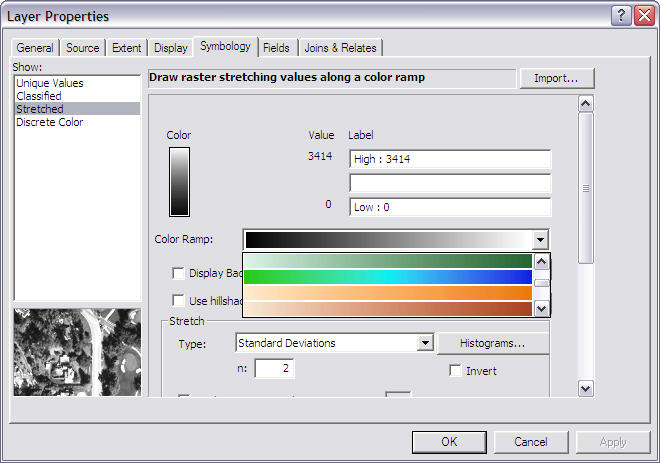
You probably don't have any great love for the continuous grayscale that ArcMap puts on your DEM display as a default. However, displaying DEM information clearly and attractively is tricky. There are a number of options in ArcMap to improve the display of the DEM:
DEM Display Improvement #2: Style Manager. ArcGIS's Style Manager gives you access to a number of very useful pre-defined symbols and color ramps. You can also save styles that you create.
- Close your Layer Properties window.
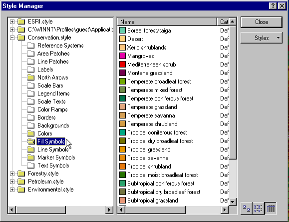
- In ArcMap, go to Menu Bar --> Tools (not ArcToolbox!) --> Styles --> Style Manager.
- You should get a window like this. It works much like Windows Explorer or ArcCatalog:
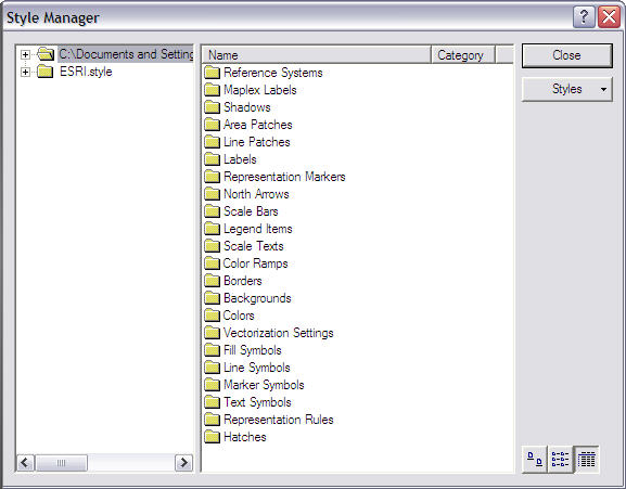
- ESRI.style contains the predefined styles, while the second folder contains styles designed or copied by the current user (in this case that is you and whoever else has been using the computer). You can see that the styles are grouped for various uses -- Reference Systems, Area Patches, etc.
- Click on the
button. You can see a large number of topics which ESRI has created predefined styles for. You can click on them to add them for a particular project. E.g., a person mapping vegetation might use something like this:
- The most useful color ramp styles are in ESRI.style. Go to Color Ramps and then scroll down until you see Elevation #1: (you can move the line between Name and Category so you can see more of the Name)
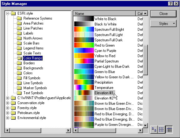
- Highlight it. Right-click and Copy. Navigate to the Guest directory and then to the color ramp folder. Right-click, Paste in the right pane of the window. Close the Style Manager.
- Now, when you return to Properties-->Symbology for hood_dem, you should have the Elevation #1 color ramp available somewhere in your list of color ramps (probably at the top). It won't be labeled; but it should look like this:

For More Info on Styles:
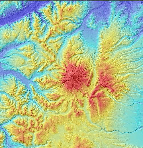
ESRI's ArcUser article on Map Making with Styles.Use this color scheme or Elevation #2, if you like. These color schemes probably succeed because they use a variety of colors, instead of just shades of one or two colors; and because the colors are arranged in a way that parallels map conventions we are used to (white for mountain tops, etc.)
Note: Our own Dr. Kimerling is in part responsible for the development of the continuous graduated color ramp for the display of elevation information.
More on ArcGIS 9.x Extensions:
Much of the GIS functionality needed for scientific research comes from extensions to ArcGIS. These are software add-ons that make new tools accessible. When installed (they must be purchased from ESRI, of course) they will be accessible as new tools in ArcToolbox and/or as new toolbars in ArcMap (the latter are those drag-and-drop toolbars, such as the Layout, Draw, Effects, and Network Analysis toolbars, which you have accessed from ArcMap's Menu Bar --> View --> Toolbars).
You are probably familiar with ArcView extensions such as Spatial Analyst. As ArcView is folded into ArcGIS 9, ESRI makes the functionality of these extensions available as ArcGIS extensions.More on ArcView extensions from ESRI's site
More importantly, you have the option of downloading free extensions and scripts with a tremendous variety of functionalities. Try going to the ESRI ArcScripts page, and search for extensions for ArcGis 9.x. (A really good one is XTools.) These are generally free to use, easy to install, and can often complete tasks with the click of a button that might be difficult or impossible otherwise.
There are many other options for displaying DEMs, although using them in ArcGIS 9 will depend upon the availability of various extensions such as 3-D Analyst - available to users of the Digital Earth lab thanks to our OSU campus site license. Some common extensions from ESRI that you will see: 3-D Analyst, Spatial Analyst, Geostatistical Analyst.
Your map -- Data frame #1:
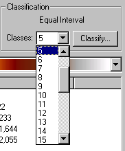
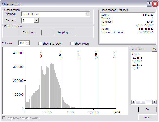
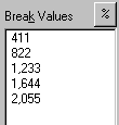
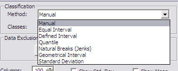
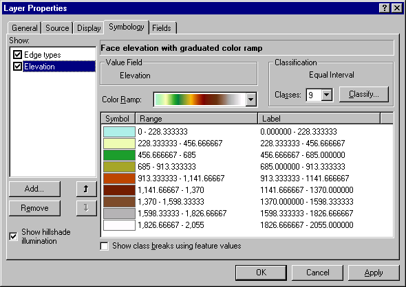
Use a classified map of the hood area elevations for your first data frame.
|
Answer Question 1 : While you were classifying the DEM, you may have noticed an unexpected empty lines in the histogram of the data. Go back and look at the histogram again. The distribution of elevations is not what you would expect if the elevation had been directly measured for every pixel as would be the case in, for example, an SRTM DEM. (An interesting experiment is to examine a hillshade of this DEM - you will see strange patterns in the areas of low slope.) Create a Hillshade of this DEM (look in spatial analyst in the surface menu) Zoom in and describe the patterns found in your hillshade and explain why they are there (Try looking carefully in very flat areas as well as on slopes - an excellent example can be seen around 2383796 meters longitude, 219884 meters latitude) - There are two sources for the obvious patterns. |
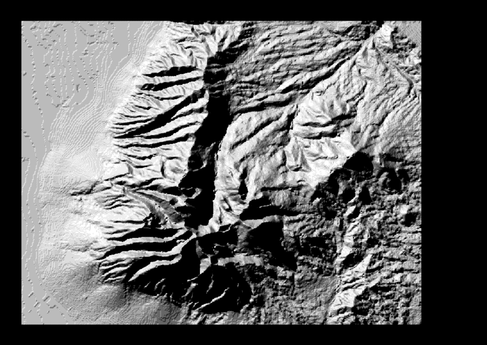
If you haven't already done so, create a hillshade of hood_dem(see above). Now set the transparency of the Hillshade by going to its properties-->Display tab and changing the transparency to 50%. Make sure the Hillshade is on top, and the DEM underneath. You should see something like the image below. This is an impressive and useful display technique when producing a cartographic product.
 |
Review the Introduction to this lab and the Lab 2 to make sure you have a clear idea of what data structures are and what the main kinds of DTMs are.
Contours. Create a contour coverage from our DEM, hood_dem. Space our contours every 200 vertical meters.
First, find the Contour tool in ArcToolbox. If you have
trouble finding it, use the Search tab in the toolbox pane.
|
- Check to see if the projection is defined for your contours shapefile you created. If not, Define the projection of your new hood_contours shapefile based on hood_dem using the Define Projection tool in ArcToolbox or with its ArcCatalog properties.
- Add hood_contours to ArcMap in your second data frame..
| Your map -- Data frame #2: Use this elevation contour layer for your second data frame. |
TIN Creation. Now, we're going to create
two TINs from our elevation data.
|
Possible bug: When converting from Grid to TIN, first try the tool in the IMPORT TO TIN folder, rather than then EXPORT FROM RASTER folder. In theory it is the same tool, but when running from one rather than the other you will occasionally receive an error that you are not licenced to use TIFFLZW. If you receive this error, try the tool in the other folder. If you still can not make the tool work, consult with your TA. This problem is because the LZW compression format is licensed. Companies that do not pay the licensing fee may not use LZW compression in their software. Other forms of compression with comparable output are available. |
First, we will utilize ArcMap with the 3-D Analyst Extension to convert
the grid hood_dem to a TIN. Alternately this could be accomplished in
ArcToolbox.
|
Second, create a TIN from our contour coverage hood_contours - This
could be converted using the ArcMap 3-D analyst, but we will use the ArcToolbox
TIN creation tools. (It is a two part process, using Create TIN and Edit TIN)
|
| Answer Question 2 : DEMs and TINs are often referred to as "2 1/2-D" rather than "3-D." Why do you think this is? Hint: In a surface, how many z-values are there going to be for a given (x, y) coordinate? In a system that requires a truly 3-D structure, how many z-values are possible per (x, y)? |
| Your map -- Data frame #3: After answering the questions dealing with the comparison of the two TINs, leave the best TIN in frame 3. (You can uncheck Edges in Symbology for visual display) We will use it as part of our viewshed analysis map (see below). |
| Answer Question 3 : Upon visual inspection, what are the differences between hood_dem_tin and hood_con_tin? Consider: level of detail and information lost in the creation of each TIN. Also use the identify tool and click around in the Columbia River Gorge for both TINs. Explain the elevation results for the Gorge in both TINs and the reason for the differences between them. |
| Answer Question 4 : Examine the histograms for your two TINs. What are the unnatural patterns in each and what are the likely causes of them? How might these patterns be made more natural? |
Topographic Shading in TINs. You can see that your TINs display topographic shading by default:
| Hint You won't be able to see  |
To turn off shading, go to Symbology (again) and uncheck
this box:
|
| Answer Question 5: What kinds of geographic information would be most useful to you if you were seeking to mitigate the major problems you have discovered with the TINs above? Especially consider: what would be the best source data to use for generating TINs? |
| Definitions (from the ESRI GIS Glossary): |
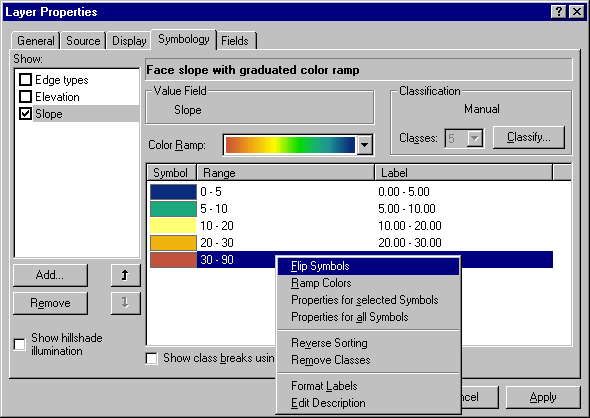
To Display Slope:
|
| Answer Question 6 : Landslides in the Columbia River Gorge can have a severe effect on transportation networks. An important rail line, extensive electrical infrastructure, a economically valuable barge route, and an important highway run through the gorge. Imagine that you have been hired by the Bonneville Power Administration to use GIS to identify areas where landslides are a possibility. Obviously in real life, one would need specialist training or advice to adequately do such a job - but you should be able to lay out a general strategy for such an analysis (what data layers you would need and what kinds of analysis you would do). Do so in one paragraph. |
|
Your map -- Data frame #4: |
First, we will conduct a viewshed analysis.
Viewshed analysis is useful for several purposes, such as determining the views
available from roads, lookouts, and housing developments. For example,
logging or building may be restricted in National Scenic Areas or areas viewable
from highways. This can be done with the 3-D analyst, but the output options
are greater with ArcToolbox coverages.
First, we have to create a point feature shapefile from which to do the
viewing.
|
| Question #7 : What is your assessment of the viewshed? Does it fit with what you would think can actually be seen from that point? What would account for differences? |
| Your map -- Data frame #3: In frame 3, use the TIN you have left here to represent elevation. Then display your viewshed and viewpoint on top of this. |
Save your project so far. Close down and Open a new blank map document.
Our second analysis will examine the relationship
between elevation and vegetation. Drag org_gap-clip into ArcMap.
We will use the skills we have learned for displaying and converting data and
then investigate the questions by visual inspection. You will have to
decide how best to display the vegetation and hood_dem to answer the
questions below. Note that there is an orgap_lut (look-up table) file in the
directory. You can use your skills to import this file into ArcMap, and
join it with the GAP shapefile. You should also add the Hood_names file.
| Question #8 : Describe the vegetation profile as you move along a
straight line from Red Lake Cemetary (in the very south easternmost corner
of the scene) to the White River glacier (use the hood_names layer for
names, use the query function to find locations). Make a list of
the vegetation types in the order that the line crosses them, and give
approximate elevation ranges for each of the vegetation types. (Generalize to about 11 sections)
Note: There are several decent ways to do this. To get really tricky, using the 3D analyst, create a temporary 3D polyline along the same track, and create an elevation profile to add to your work... (not required) |
|
Now load the hood_landcov coverage. Examine its attributes. Do you know what the Values field in this grid represents??? It is common that files are delivered with text describing their attributes, either in a seperate LUT (look-up table), a text file, or in the metadata. This can be a problem if the text is extensive, requiring some effort to format for use.
Using a web browser, open the hood_landcov.met.html. Near the end is a list of the values, and their text meanings. We don't want to have to type these all in and create a legend by hand. Normally, you would clip the data, add it to a new text file, and format it. However, to speed things along, the text has been removed and formatted for you in a file called hood_landcov.txt. The trick is to convert the text file into a table, and join it with the appropriate coverage (or in this case, grid). Open the text file from windows explorer, and examine it in NOTEPAD, WORDPAD, or the editor of your choice. Notice the formatting of the text... commas to indicate new fields, apostrophes around text fields, and carriage returns to indicate when to start a new row. This is a fairly standard format called comma seperated text; often these files have a .csv extension.
|
| Question #9 : Compare the hood_landcov grid and the or_gap-clip and discuss when it might be most appropriate to use each one. Limit your discussion to one paragraph with the major Pros and Cons of each. |
6.5 Extrusion Visualization of Geospatial Data
6.5.1 Introduction and Background
3-D visualization is useful for much more than representing real-world features that have height. A third dimension provides a means of visualizing multiple facets of a dataset simultaneously. An example of this is the technique known as extrusion. Extrusion involves creating a 3-D data display by "pulling" or "raising" a two-dimensional polygon up along a Z-value height to make columns. The resulting image resembles a cityscape of high-rise buildings. In terms of maps, this can be used either to 1) give extra emphasis to features on a map, but not display additional data; or 2) display two dataset attributes at the same time, one represented by the color scheme of the polygons and another by the extruded columns.
In this exercise we will be using extrusion to compare socioeconomic data from the U.S. Census with national voting patterns. We will be using ArcGlobe to give you some practice with an additional (and fun!) ArcGIS module.
The dataset we will use in this exercise, the "2004_election_counties" shapefile, can be found in your "Lab6" folder that you created previously. The shapefile contains voting data at the county level for the 2004 U.S. Presidential election, covering the lower 48 states.
3.3 Procedure
This exercise will use ArcGlobe, ESRI's module for global data display. Take a few minutes to explore ArcGlobe before we begin working with the data.
Open ArcGlobe via the Start menu under Programs -> ArcGIS -> ArcGlobe.
Step 1: Add & symbolize data
First, turn off the Countries layer to simplify the display a bit.
Use the Center on Target tool from the toolbar to center the display on the middle of the US, and zoom in if appropriate.
Add the "2004_election_counties" shapefile to the ArcGlobe display. (Click OK if there is a projection-related warning.) Before adding the layer to the display, ArcGlobe will ask you about setting an appropriate display scale for the visualization. You can simply accept the given defaults.
Take a moment to look through the "2004_election_counties" attribute table. You will see that the attributes are a combination of Census data followed by various categories of election results (see the excel table “2004_election_counties_obmeta” for metadata information on each attribute). The election data include total vote counts and vote percentages for George Bush and John Kerry in each county. The fields “Bush_pct” is the attribute we want to display on the map.
Right-click on "2004_election_counties" in the Table of Contents and choose Properties, then click on the Symbology tab. In the left-hand column, choose “Quantities” -> “graduated colors” as the display type. Change the drop-down Value menu to "Bush_pct". In the “Classification” box on the right, click on the “classify” button and change the interval method to “equal intervals”. Click on the “labels” button, and change the number of decimal places to 0. Finally, choose a color scheme that makes sense to you (i.e. light to dark colors representing high to low percentage of Bush voters).
Step 2: Extrusion
We will now do an extrusion of a second attribute in the dataset. Right-click on "2004election_county" in the Table of Contents and choose Properties, then click on the Globe Extrusion tab. Check the box labeled "Extrude features in layer". The panel below it labeled "Extrude value or expression:" determines which attribute (and any modifiers of it you wish to add) will be used for the extrusion. Note that the extrusion units will be meters. Click on the Expression Builder button next to this panel to bring up the Expression Builder window. Scroll through the attributes listed in the Fields panel on the left for "POP00SQMIL" (2000 population density) and double-click on it. The attribute will be added to the Expression panel. To make sure the extrusion columns will be tall enough to easily view (remember, the extrusion units are meters) add a multiplication by 100 to the expression. Click OK to apply the expression, then OK again. You may need to turn off the "World Image" layer in order to see counties with low population densities.
You now have a visualization of the population density of each county, colored according to the percentage of Bush votes in it. Explore the display and look for any revealing patterns.
| Question #10 : Generally speaking, what is the apparent correlation between percentage of Bush voters in a county and that county's population density? Can you find any exceptions to the pattern? |
Step 3: Exploratory analysis
Now that you have learned the extrusion process, it is time to use it for some exploratory analysis on your own. Look through the dataset attributes and try to come up with another socioeconomic factor (i.e. other than population density) that you think you might partially explain the voting pattern depicted on the map. Visualize this factor as you just did for population density above. Be sure to normalize the attribute if appropriate, and give it a scaling factor in the extrusion equation if needed for greater visibility. (Note: Area may not necessarily be the appropriate factor to use for normalizing your attribute!)
In this lab, you learned about the basic data structures used for surfaces in ArcGIS. You can see that each has advantages and disadvantages in terms of conveying information, in conducting various analyses, and in accurately representing the real world. You should also have an appreciation for the uses and hazards of converting surface data between structures. Surface modeling is a key part of many GIS analyses, but the results attainable will depend upon the data and software tools available. Most important, however, is the intelligent use of the data and tools by the GIS user.
Weibul, R., and Heller, M. "Digital terrain modelling." In Geographical Information Systems: Principles and Applications, edited by Maguire, David J., Goodchild, Michael F., and Rhind, David W. London: Longman Scientific and Technical, 1991, pp. 269-297.
Lab originally created by Nicholas Matzke and Sarah
Battersby
UC Santa Barbara, Department of Geography
© Regents of the University of California; redistributed by permission
Modified by Jeremiah Knoche, Mark Bernard, Tracy Kugler, and Dawn Wright, OSU Geosciences
http://dusk.geo.orst.edu/buffgis/Arc9Labs/Lab6/lab6.html