
Page 37 - GIS for Science: Technology Showcase
P. 37
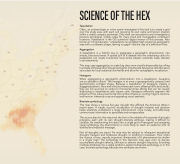
 SCIENCE OF THE HEX
Tessellation
Often, an archaeologist or crime scene investigator's first task is to create a grid over the study area, with each cell receiving its own name and known location within a neatly compact perimeter. Only then can excavations and investigations become procedural, orderly tasks for many small and manageable constituent locations. Tessellation is the GIS scientist's digital version of this process. Also known as "tiling the plane," a tessellation is a gridded mesh covering a geographic area with a consistent shape, leaving no gaps—like the tiles of a bathroom floor.
Aggregation
A tessellation is a helpful way to aggregate a geographic phenomenon into simple, bite-sized areas. A spatial join of a dataset into the underlying cells of a tessellation can create convenient local zones wherein scientists make discrete local statements.
This map uses aggregation to make big data more visually discernable by rolling hundreds of thousands of drought polygons into discrete hexagonal cells that serve as buckets for local statistical summaries and allow for cartographic visualization.
Hexagons
When aggregating a geographic phenomenon into a tessellation, hexagons are an excellent choice. The hexagon is at once a geographically compact and geometrically complex shape. Because a tessellation of hexagons creates a staggered pattern, like a wall of bricks where each row is offset by half a brick width, they are not as prone to vertical or horizontal stripe effects that can be visually distracting in tessellations with square cells. Hexagons efficiently segment the patterns of the natural world, like the combs of bees or cooling magma columns, and have an inherently crisp and appealing visual aesthetic.
Bivariate symbology
This map shows a ruinous five-year drought that afflicted the American West in recent years. A single, succinct visualization of drought intensity and duration helps scientists understand a large phenomenon more locally, and effectively communicate information to specialists and nonspecialists.
The source data for the map took the form of hundreds of thousands of drought polygons, each with its own drought-intensity attribute, making it difficult to visualize. By transforming this data into a single grid of hexagons and assigning visual symbology, the phenomenon is more likely to reach an audience with its distilled and impactful message.
Not all droughts are equal. An area may be subject to infrequent exceptional drought, frequent and moderate drought, or anything in between. How might the nuance of two, equally important, dimensions of a phenomenon be shown in a single map? The symbology in this thematic map uses color to denote accumulated drought severity, and size to denote drought frequency. Encoding multiple attributes into a single symbol is called multivariate symbology, or in this case, bivariate symbology, because two attributes are shown.
