
Page 8 - GIS for Science: Technology Showcase
P. 8
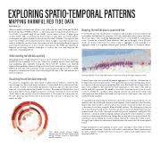
EXPLORING SPATIO-TEMPORAL PATTERNS
MAPPING HARMFUL RED TIDE DATA
Ankita Bakshi, Esri
When harmful red tides form off the coast of Florida, the state's Fish and Wildlife Research Institute (FWRI) is there to collect data and document the phenomenon. A red tide, or harmful algal bloom (HAB), occurs when colonies of algae grow in abnormally high concentrations and produce toxins that can harm marine ecosystems and public health. In Florida and the Gulf of Mexico, the species that causes most HAB events is Karenia brevis, which in high concentrations discolors water a reddish-brown hue, hence the name red tide. By understanding the spatial and temporal dimensions of the red tide observations, the FWRI can implement targeted monitoring research strategies to reduce the cost and improve the efficiency of sampling efforts.
Understanding red tide data spatially
Identifying areas of high values (hot spots) and low values (cold spots) using the ArcGIS Hot Spot Analysis® tool is one of the most common ways to start exploring and analyzing data spatially. Using the Getis-Ord Gi* statistic can identify statistically significant clusters of high and low red tide observations. Applied to the FWRI red tide data, this technique found a statistically stronger presence of HAB along the southwestern Florida coast extending all the way to the embayment area in the northwest.
Visualizing the red tide data temporally
The duration of algal blooms varies based on physical and climatic conditions. We can leverage the data clock temporal chart to understand these patterns and the data in time. A data clock visually summarizes temporal data into 2D and reveals seasonal or cyclical patterns and trends over time. The temporal distribution of red tide in this chart reveals a higher frequency of red tide observations in the months of fall. The blooms mostly occur from September to November. In some years, the bloom’s stay was short-lived, but in most years the red tide continued into the winter months.
Mapping the red tide data in space and time
Powerful 2D and 3D visualization techniques and integrated trend analysis help us visualize and analyze the presence of blooms simultaneously in space and time. The Create Space Time Cube. By Aggregating Points tool in ArcGIS Pro summarizes a set of points into a netCDF data structure that can be thought of as a 3D cube made up of space-time bins. A common way to aggregate points spatially is to aggregate them to a regularly shaped grid (either a fishnet or hexagon shape).
3D map (detail) of red tide observations over time along Florida’s western coast.
A space-time cube was created by annual aggregation of red tide observations to hexagon bins with a spatial extent of 10 square kilometers. Any missing data, which is common in monitoring and sampling data, were filled with the average value of space-time neighbors. The map shows a 3D visualization of the space-time cube in which each bin represents the number of red tide observations in a year for each location. ArcGIS Pro includes many display options, all with preset symbology and range and time sliders that make the exploration of the space-time cube and analysis results intuitive.
To quantify and understand the patterns in these thousands of stacked bins, we can visualize the cube in 2D and calculate trend analysis. Trends analysis in the Visualize Space Time Cube In 2D tool shows where the red tide observations have increased or decreased over time using the Mann-Kendall statistic. The dark-green locations show a downward trend in the observations. The locations in dark purple have an upward trend of red tide observations with 99 percent statistical confidence. The results are consistent with the spatial analysis using the Hot Spot Analysis tool. The areas in southwestern Florida near Tampa Bay mostly show an upward trend. The embayment areas behind the barrier islands such as the Apalachicola Bay and St. George Sound, where the tributaries drain nutrient-rich water, also show an upward trend.
Using visualizations and analysis in space, time, and space-time helps us better understand the patterns of red tide in Florida's coastal waters. These visualizations arejustasubsetofmanymethodsyoucanusetoexploreandanalyzespace-time data in ArcGIS Pro.
  This data clock shows higher frequencies of red tide observations along Florida's coasts in September and November.
